The stable release of iOS 18 has finally arrived! This latest version includes a wealth of new features, enhanced customizations, and significant improvements, establishing it as the most substantial iPhone software update to date. While iOS 18 introduces exciting customization options, some of the changes feel disorienting, especially for long-time iPhone users like myself. The most notable change for me is the ‘redesigned’ Photos app. During the preview of iOS 18 at WWDC 2024 in June, Apple claimed that the Photos app received “the biggest-ever redesign,”aiming to make photo searches faster and more convenient.
Although Apple believes the revamped Photos app enhances user experience, I find it more complicated and overwhelming. Initially, I thought I was alone in my dislike of the new design, but it turns out many Reddit users share my sentiments and are expressing their frustrations regarding Apple’s modifications.
Changes in the Photos App in iOS 18

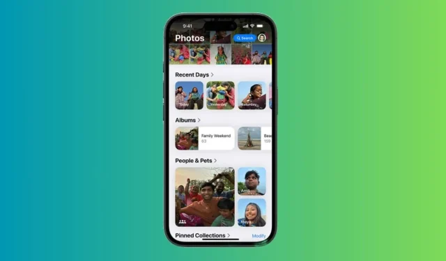
The Photos app in iOS 18 introduces a feature called Collections, which automatically organizes your photo library into themes such as Recent Days, Memories, Trips, People & Pets, among others. Upon opening the Photos app in iOS 18, users will immediately notice the absence of separate tabs. Instead, they are presented with a centralized Photo Library grid that displays about 30 images simultaneously.
Previously distinct sections of the photo library are now consolidated into a single, scrollable view. Additionally, images that were formerly located in the “For You” section are now categorized under various collections. To access the complete Photo Library view, you must scroll down, allowing you to zoom in or out to see more or fewer photos at once. The updated layout includes Years and Months options for navigating your photo history, but the Days option has been replaced by the Recent Days Collection.
The New Design Diminishes Simplicity
Upon my first experience with the Photos app in iOS 18, I immediately longed for the clean interface that featured separate tabs at the bottom of the screen. Apple has removed the tabbed navigation bar, opting for a scrolling design that I find makes the app feel slow, cluttered, and perplexing. Rather than simple tabs, users are faced with collections organized by themes. I personally find it overly complicated to navigate through numerous automated collections, each vying for my attention. The previous Photos app already included various themes and categories, but the iOS 18 version’s single scrollable page complicates photo searches.
Perhaps my frustration stems from being accustomed to the older version, but I appreciated having all my photos in one accessible location. Now, images saved on my iPhone are dispersed among different folders. For instance, I often download images from WhatsApp, which I could quickly find under the All Photos tab in the older iteration. Now, my downloaded images are automatically classified under the Recently Saved collection. Furthermore, sections like Favorites and Utilities are now nested within that tedious scrollable page under “smart” memories. Every time I attempt to find a particular photo, I end up scrolling through multiple sections to locate the right collection, as my familiarity with the layout hasn’t yet developed.
In addition to the confusing navigation, the new Photos app has altered how I view and edit videos on my iPhone. In iOS 17 and earlier versions, playing a video in full screen was as simple as tapping it once. In iOS 18, however, a single tap will not suffice; I must tap twice to achieve full-screen mode. Furthermore, video thumbnails have changed, with previews no longer displaying timestamps, complicating the process of trimming videos at specific points.
Overall, the new layout of the Photos app feels less intuitive and user-friendly, negatively impacting the simplicity I had become accustomed to as a long-term iPhone user. For me, the iOS 18 Photos app does not constitute an upgrade; rather, it seems like a disorganized step backward.
Some Customizations Are My Saving Grace
Despite my nostalgia for the previous design, I have discovered a few customization options that make the iOS 18 Photos app more tolerable. If you share my sentiments about the old iPhone Photos app, you may find these customizations beneficial.
Hide or Change Collections for a Personalized Experience
If there’s one aspect of the iOS 18 Photos app that Apple executed well, it’s the ability for users to personalize their experience. This feature has allowed me to adapt the interface to better suit my needs. Here’s how I customized my photo library for easier navigation:
- Open the Photos app, scroll to the bottom, and tap on Customize & Reorder.
- On the next screen, you can hide unnecessary collections or reorder them to reflect your preferences.
- Simply uncheck the collections you want to hide.
- To reorder collections, just tap and hold a collection to move it. I prefer to keep the ‘Albums’ and ‘Recent Days’ collections at the top.

- Additionally, I removed Maps from the Pinned Collections and replaced it with the Selfies folder.

Hide Screenshots from Photos Gallery
As someone who frequently takes screenshots for work, my photo library often becomes cluttered with these images. While I don’t want to delete them, I appreciate the option to hide screenshots from the main photo feed and keep them organized in a dedicated Screenshots folder under Pinned Collections. Here’s how I manage this:
- Open the Photos app on your iPhone.
- As you scroll through the photo library, look for a new icon (an up and down arrow) at the bottom. Tap it and select View Options.

- Now, uncheck the Show Screenshots option. This will instantly hide all your screenshots from the photo gallery.

- You can find all of your screenshots in the dedicated Screenshots folder under Pinned Collections.
While these adjustments won’t restore the nostalgia or simplicity of the previous version, they do help make the Photos app less daunting and confusing than it seemed initially. However, users will still need to invest time in relearning their navigation habits.
The new layout may not be entirely displeasing, but it does introduce unnecessary complications that require adjustment. I look forward to seeing how the iOS 18 Photos app will integrate with Apple Intelligence, as Apple asserts that the app has been redesigned to work seamlessly with their AI systems. I hope forthcoming AI features will facilitate easier photo searches and edits, making this supposedly “redesigned” app less cumbersome. Do keep in mind that not all iPhones will support Apple Intelligence; if you own a compatible model, you’re fortunate.
Do you also yearn for the old Photos app like I do? Or have you embraced the iOS 18 Photos app? I would love to hear your thoughts in the comments below.
Related Articles:

Unveiling iOS 18.3: Hidden Features and Security Enhancements Apple Didn’t Mention
14:15
Apple’s M4 Mac Mini Review: The Unexpected Champion in Chip Performance
13:39
Sony Enters Strategic Partnership with Apple: Unveiling Exciting Deal Details
16:46
Leave a Reply